What is Moaiku?
Moaiku is a sound word put together by three syllables: MO-AI-KU. It names the vision and poetry that lies behind the method-development, I have been leading since 2003. The sound-word emerged in my head one night in 2006, when I was opening up to finding a new name for my work - and I chose to use it. "Moaiku" doesn't say anything about the professional content of the method. The professional name is Relational Trauma therapy.
The sound-word speaks is sensually based. It is a sound that impacts the body; a vibration, a sensory experience here and now.
In me it opens a sensation of an inner space connected to a greater external space – a space where all colors, sounds, states of consciousness are contained, and are what they are.
Moaiku can also be explained as a composite of 2 words: Motorfunction and Haiku – or motoric haiku. A merging between body movement and a precise form of expression focused on communicating sensory experiences here and now.
”Classic haiku are ultra-short poems with 17 syllables divided on three lines with 5-7-5- syllables. They are about something you experience with your senses: See, hear, feel, smell or taste. They take place in the present, describe an event as when you ’catch an event’ with your camera.” (Quote from www.sys-matthiesen.dk - in my translation.)
In my professional development I have from early on been engaged in psychomotor skill training. I have been teaching the same exercises and bodily psychosocial skills since 1977. I have refined, through numerous repetitions, the teaching and my own understanding of the profound effect of this body and cognitive skill training. The method focuses on healing through presence and coping here and now, based on exact individual “dosing” of exercises and automatization through repetition. To me it makes sense to name this way of working ”Motoric Haiku”.
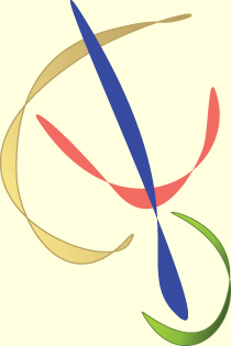
Moaiku Logo
I drew inspiration for this logo from an extract of one of my paintings from 2005 - a painting that depicts a powerful spiral movement. The shapes from this painting have since been adopted freely. The logo is created in a collaboration between Flemming Brantbjerg and myself. The symbols lying behind this logo are a spiral and a bridge and a balance between a horizontal space and a vertical carrying ability.
Both spiral and bridge are to me symbols attached to development and transition.
I think of my psychotherapeutic work as internal and external bridge building. Building bridges between human beings - between similarities and differencies, between high and low intensity,between hypo and hyper-responsive parts of the personality, between trauma-states and personality and between spirituality and grounding.
Motoric Haiku is a psychotherapeutic method that supports this kind of bridgebuilding - through skill training. It is my experience that self-healing powers are activated when inner bridges are supported and when skills are developed to cope with transitions between the many varied states contained in our human consciousness.
It always made sense to me when development was described as a spiral movement. Everybody has basic themes we work on containing, understanding and integrating. In a process of maturing we encounter the same themes over and over again in more complex and mature forms, just as you come back to ”the same place” in a spiral, merely a round higher up or further ahead. This is how the spiral provides me with an image of the inner dynamics of development. The elements of the logo are elevated into a freer form, where the primary form of a spiral is barely visible anymore. It lies as an idea behind the shape.
The balance between a horizontal space and a vertical carrying ability has been of interest for me for many years. Working with these two axes in the human body supports contact to oneself, to the concrete and relational context and to a greater spiritual field.
Through the horizontal axis including breath and arms, I can sense and establish a space around myself, I can regulate my contact with the world around me – and I can reach into a greater spiritual space.
The vertical axis includes the connection from feet and all the way up through legs, spine, neck and head – up to a point over my head and down to a corresponding point under my feet. Through this axis I gain a physical ability to carry myself and to let myself be carried, and to connect to both the ground and to space.
Both the horizontal space and the vertical carrying ability, are present in the logo - in balance with each other.
The logo is asymmetrical. All elements are in motion, they don't have a fixed place – and they all relate to a point of balance in the figure: Centering, mobility and connection.
The colors of the logo are drawn from a transmodal perception of the three syllables in Moaiku. ”MO” to me opens to a deep coppery orange resonating with my lower body. ”AI” opens to a green, pink and golden space within and around my heart. ”KU” is a clear dark blue beam down through my body. These color experiences in modified form are found in the logo.